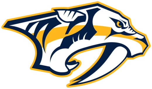
The 1998 Fanged Predator Logo
Fangs bared, gold flash, black shadow—Nashville's first howl in the NHL.

The 1998 Fanged Predator Logo is the original primary mark of the Nashville Predators, the NHL expansion franchise that entered the league for the 1998–99 season. Designed as part of the team's pre-launch branding, the logo depicts a snarling, stylized big-cat predator with bared fangs, rendered in the franchise's signature palette of black, gold, and white. It became the visual identity that thousands of new Nashville hockey fans latched onto before the first puck ever dropped in the city.
For the first several seasons, this fanged mark was the face of the franchise—stitched onto jerseys, stenciled on arena signage, and splashed across every piece of merchandise a young fan could buy. It represented what Nashville was trying to be in the hockey world: a new, aggressive, unapologetic voice in a league dominated by long-established northern clubs. Even as the team's visual identity evolved in later years, the 1998 fanged predator remains the logo that defined the franchise's origin story and still carries a deep, almost tribal resonance with the earliest generation of Predators supporters.
- Team
- Nashville Predators
- League
- National Hockey League (NHL)
- Franchise type
- Expansion team
- First season
- 1998–99
- Primary colors
- Black, Gold, White
- Original home venue
- Nashville Arena (later renamed)
Lore & Background
When the NHL awarded Nashville an expansion franchise, the city had never hosted a major professional hockey team. The design brief for the new identity was, in the minds of the local fans who would later adopt it, almost a dare: make something that looked like it could bite. The resulting fanged predator mark—angular, aggressive, rendered in the sharp contrast of black and gold—fit that brief. It was not a gentle mascot. It was a warning. In the months before the 1998–99 season, that snarling face appeared on press releases, on the walls of the new Nashville Arena, and on the very first wave of team merchandise, and it became the visual shorthand for a city announcing itself to the hockey world.
The logo's cultural weight grew in those early, scrappy seasons. Nashville was not a traditional hockey market; the fanbase was built from scratch, season by season, in a city more accustomed to country music and football. The fanged predator gave those fans a totem. Wearing the logo on a jersey or a hat was a small act of defiance—proof that a Mid-Southern city could claim a place in a league long dominated by the Northeast and the Great Lakes. The black-and-gold color scheme, paired with the angular fang geometry, became almost liturgical for the early crowd: you wore it, you chanted, you belonged.
As the franchise matured and its visual identity underwent refinements in subsequent years, the original 1998 mark was set aside in the visual hierarchy but never truly discarded in the hearts of the first generation of fans. For many, the fanged predator is not just a logo; it is the specific, unrepeatable moment when Nashville decided it wanted hockey, and the logo was the first thing that said *yes*.
In Their Own Story
October 1998. The Nashville Arena is still new, the seats a little too clean, the concrete still smelling faintly of polish. A kid in a too-big black-and-gold jersey presses his face to the glass during warmups, watching the fanged predator logo painted on the boards glow under the arena lights. The crowd is maybe six or seven thousand, not the packed house he'll see years later, but the noise is a living thing—stomping, whooping, a sound like a held breath finally released. The puck drops. The kid's mother, who doesn't understand hockey at all, is standing in the aisle with her arms crossed, and she is smiling. The fanged logo on the jumbotron stares out at them all, patient and sharp, and for one long, golden season, that is enough. That is the whole world.
Reader's Guide
You want to understand what that fanged predator logo actually meant to Nashville? Stand in the lower bowl of the arena on a home-stand night and listen. It's not the roar of a football crowd. It's a low, rolling, almost industrial hum that builds when the puck is in the neutral zone, and then it *cracks* open when a goal goes in—six thousand voices hitting the same note at the same time, and the glass in front of you vibrates in your palms. That sound was new in 1998. Nobody in Music City had ever heard it before, and the fanged logo on the jumbotron was the thing that made it feel like *ours*.
The logo mattered because Nashville was not supposed to be a hockey town. We were a country-music town, a football town, a barbecue town. And then this black-and-gold snarling cat showed up on a jersey, and suddenly a kid in East Nashville was cutting his hair and buying a stick and arguing about the penalty kill with his uncle at a Waffle House. The fang mark was the permission slip. It said: you don't need to be from Minnesota. You just need to be here, and you need to be loud.
Long-time fans will tell you the logo was *angry* in a way the later designs smoothed out. And they're right. It had teeth. It had intent. And in a city that was still figuring out what it was, that kind of intent was the whole point. You wore the fang, you owned the night, and nobody in the league was going to tell you that didn't count.
Did You Know?
- The Nashville Predators entered the NHL as an expansion franchise, beginning play in the 1998–99 season, making the fanged logo one of the newer visual identities in the league at the time.
- The franchise's original home, the Nashville Arena, was a multi-purpose venue that had hosted various events before becoming the Predators' home ice, and the fanged logo was among the first major sports branding applied
- Nashville's entry into the NHL was part of a broader expansion wave, and the fanged predator mark was designed to give a non-traditional hockey market a distinct, aggressive visual identity separate from established nort
- The black, gold, and white color scheme paired with the fanged mark became a defining visual for the early Predators fan culture, appearing on everything from jerseys to arena signage in the franchise's formative seasons
More in Stadium & Culture
Elsewhere in the Nashville Predators universe
Spotted an error? Know more?
This is a living reference — every entry is fact-audited, and reader corrections feed straight into our audit queue. Suggest an edit · See this site's audit record